Why Do Coding Agents All Design Alike? — Research and Decisions Behind Choosing a Design Stack#
2026-07-03
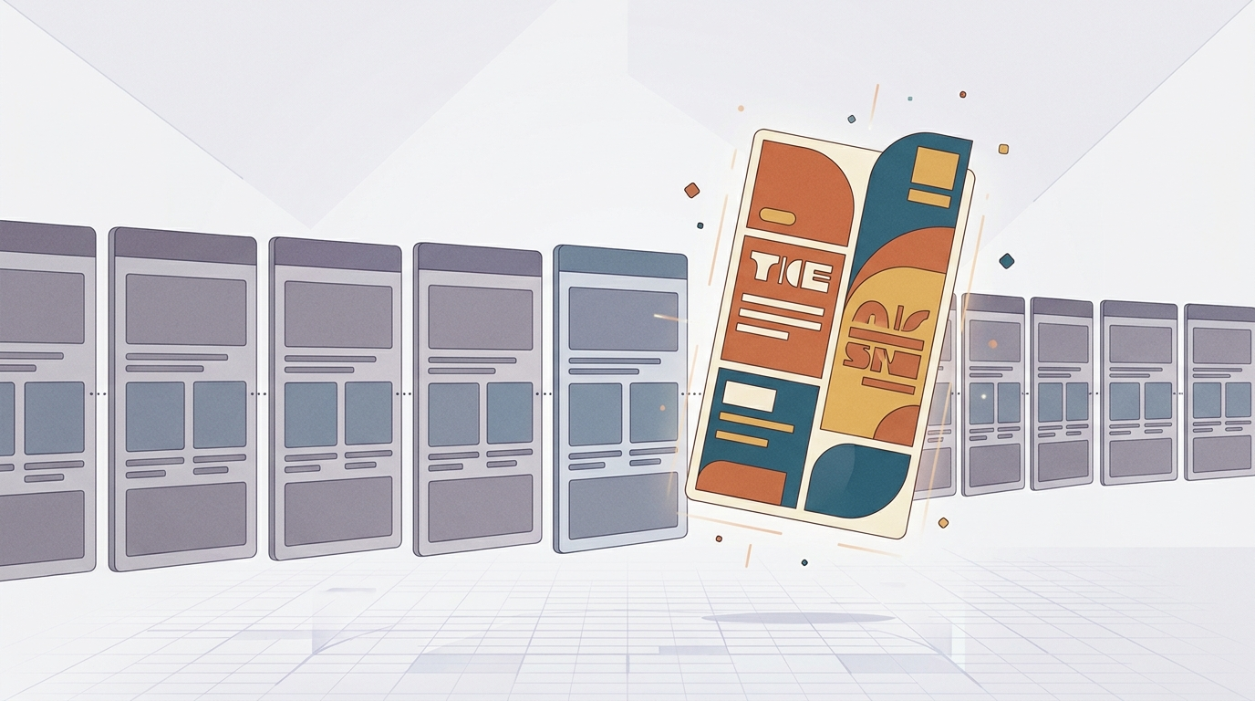
Ask a coding agent like Claude Code to design a web service and you get a reasonably decent result. Yet something feels off. The designs look vaguely familiar, similar to one another, and slightly unpolished in the details. While producing design drafts for an ongoing project, I went looking for ways to fix this, surveyed the available skills, MCP servers, and harness guidelines one by one, and settled on a final design stack. This essay documents that research and the decisions behind it.
The Root Cause: Not a Capability Problem, a Defaults Problem#
The first thing the research made clear is that this phenomenon is not caused by a lack of capability. Without directional guidance, an LLM (Large Language Model) returns the highest-probability answer. The statistical mode of a “nice button” is the Inter font, a purple gradient, a card grid, and a white background. This is why every AI-generated design looks alike.
It is also why vague requests like “make it look better” never work. A vague prompt simply summons the vague average again. The fix is not to add more capability but to deliberately steer the model away from its defaults. The model already knows how to write CSS. It just doesn’t know which CSS to write for this project, at this moment.
Seen through this lens, the tools fall into three layers.
| Layer | Role | Examples |
|---|---|---|
| Guideline packs / skills | Change the agent’s judgment and taste | frontend-design, UI/UX Pro Max |
| MCP servers | Attach new capabilities (hands and feet) to the agent | Figma MCP, browser automation |
| Workflow | Wire up the build → look → fix loop | Screenshot-based visual verification |
Skills govern “how it thinks,” while MCP (Model Context Protocol, a standard for connecting external tools to an agent) governs “what it can do.” Because they operate at different layers, they are in principle complementary rather than competing. But as we will see later, there are exceptions.
The Tools I Surveyed#
frontend-design — An Anti-Default Philosophy#
This is Anthropic’s official skill. Surprisingly, it is a short document of just a few dozen lines. It provides no components or code snippets — it instills an attitude and a procedure.
Two things are central. First, it names and bans the clichés that AI design gravitates toward: cream background + serif + terracotta, dark background + a single neon accent, and newspaper-style layouts. It states flatly that these three are “defaults, not choices.” Second, it enforces a two-pass procedure before any code is written. You first build a token system consisting of 4–6 colors, fonts by role, a layout, and the single signature element this page will be remembered by — and only after that plan survives the self-critique “would I have arrived here for any similar request?” may coding begin.
Its guidance on restraint is also striking. Spend your boldness in one place — the signature — and keep everything else quiet, it says, quoting Chanel’s advice: before leaving the house, look in the mirror and remove one accessory.
Superdesign — A Good Concept, But an External Dependency#
Superdesign installs as a skill, but in substance it is the frontend of an external SaaS (Software as a Service, a cloud subscription service). It requires a CLI install and login, sends your repository’s component source to its service, and generates design variations on an infinite canvas. There is a free tier, and the paid plan is a flat $20 per month.
The functionality was intriguing, but I put it on hold, because I did not want to create a dependency on an external service at this stage. It is something I plan to revisit once the service grows and calls for stronger design. That said, the DESIGN.md concept that Superdesign champions is worth adopting independently of the tool. I return to it below.
UI/UX Pro Max — A Design Encyclopedia#
UI/UX Pro Max is the most popular community design skill (roughly 98k stars) — in a phrase, a design encyclopedia plus a search-and-recommendation engine. It bundles 67+ UI styles, 161 color palettes, 57 font pairings, and 161 industry-specific reasoning rules. Tell it a product type, such as “a landing page for a beauty spa,” and it recommends a complete set: style + colors + fonts + anti-patterns to avoid + a pre-delivery checklist.
Crucially, it is MIT-licensed open source that runs locally. No account, no login, no source code leaving the machine. It does not trip the criteria that disqualified Superdesign.
If frontend-design is philosophy (qualitative), UI/UX Pro Max is a database (quantitative). The consensus across head-to-head comparisons is that “neither is absolutely superior — it depends on the industry, so try both on your own use case and choose.” In one side-by-side experiment, frontend-design won for a SaaS landing page and a hot-spring inn, while UI/UX Pro Max won for a Michelin-starred sushi restaurant by making the “bold subtraction” of removing the photos entirely. The observation: some industries succeed by addition, others by subtraction.
interface-design — Product UI Only, With Built-in Memory#
interface-design targets something different from the previous two. It is dedicated to product UI — dashboards, apps, admin panels — and its README states explicitly that it is “not for marketing sites.” Its slogan is Craft, Memory, and Consistency.
Memory deserves particular attention. It saves design decisions (spacing, colors, button heights, and so on) to a .interface-design/system.md file and automatically reloads them in the next session. The problem of button heights drifting from 36px to 38px to 40px across sessions gets blocked at the tool level.
MCP Servers — Mostly Eliminated#
I evaluated the MCP candidates one by one as well, and the bottom line is that in my situation every one of them was eliminated.
- 21st.dev Magic MCP: “v0 inside your editor” — it generates UI components on the fly from natural language. But it is an external SaaS requiring an API key, and its orientation — pulling “safely well-made” components from a curated catalog — collides head-on with frontend-design’s anti-default philosophy. I was not after conventional design, so it was out.
- Figma Dev Mode MCP: Figma’s official “translator” that carries designs you have already built in Figma over into code. It creates no taste of its own — it only transfers — so there is no conflict. But I do not use Figma, so there is no source material to translate. Shelved for now, with nothing to attach it to.
- shadcn studio: A commercial shadcn/ui kit plus conversion tools. By nature it converges on the distinctive shadcn look, so it was eliminated for the same reason as Magic.
One clarified insight emerged here. MCP and skills are complementary in principle, but component-generating MCPs can compete with skills at the taste layer. Reference- and execution-oriented MCPs (browser automation and the like) are purely complementary; generation-oriented ones are not. I ultimately concluded that there was no new MCP to add for design capability — the execution and verification tooling I needed (the chrome-devtools MCP) was already in place.
Conceptual Framework: Divergence, Convergence, and the Harness#
The most valuable takeaway from this research was not the list of tools but a conceptual frame.
DESIGN.md is not a tool that competes with draft generators. It is a convention: pin your colors, typography, spacing, component rules, and prohibited patterns in a single markdown file. Its role is to act as the harness that keeps subsequent design work from drifting once you have adopted one of the drafts. To summarize:
- Generators (frontend-design, UI/UX Pro Max) are divergence tools. They create direction. But they are stateless — roll them again and the results shift slightly, and they never remember that “we decided on this.”
- Harnesses (DESIGN.md, system.md) are convergence tools. They freeze the adopted direction and enforce it so the fifth and the twentieth page stay on course.
By analogy, a generator is the director who sets a brand’s art direction, and DESIGN.md is the brand guideline document that director signs off on. Every worker who joins later (the agent in the next session) reads that document and draws in the same direction.
I also found a trap worth flagging. interface-design’s system.md is a mechanism private to that skill — other skills do not know the file exists. If you want to consolidate consistency rules in one file and “delegate” to it, that file must live where every skill actually reads: for example, a DESIGN.md at the repository root referenced by CLAUDE.md, which is always loaded into context. A two-tier structure is the safe one — the shared brand layer in DESIGN.md, and product-UI-specific details in system.md.
The Final Decision: Routing by Page Character#
After generating drafts with the tools and comparing them directly, I landed on the following.
| Layer | Choice | Notes |
|---|---|---|
| Console-type screens (metrics, status, functionality) | UI/UX Pro Max | Dashboards, admin, settings |
| All other screens (landing, about, content) | frontend-design | Generates distinctive direction |
| Routing rule | Stated in CLAUDE.md | Never apply both skills to one screen |
| Brand unification | DESIGN.md (repo root) | The glue binding both skills to one brand |
| Visual verification | chrome-devtools MCP loop | Already owned; wired in via guidelines |
| Additional MCP | None | The conclusion for this stage |
Splitting the two generators by page character keeps them from colliding on the same screen, sidestepping the taste conflict entirely. But it creates a new risk: the console screens and the landing pages could end up looking like two different products. The moment the generators were split in two, DESIGN.md stopped being optional and became mandatory — it is the single unifying point that makes both generators’ output feel like one product.
Closing: Harness Design over Tool Accumulation#
If I compress the conclusion of this research into one sentence: a coding agent’s design quality improves not by stacking more tools, but through guidelines that steer it away from defaults and a harness that makes decisions stick.
And one last thing. A tool being installed is not the same as a tool being wired into the loop. Even with the chrome-devtools MCP configured, without the instruction “after building a screen, take a screenshot, look at your own output, and fix it against DESIGN.md,” the agent still builds with its eyes closed. To borrow frontend-design’s phrasing, “a picture is worth 1000 tokens.” Only once the wiring is done does the unpolished feel go away.